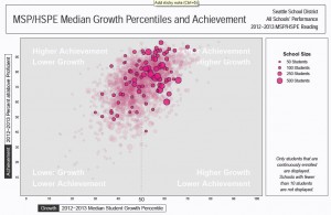
Earlier this week, the office of the superintendent of public instruction released a big bundle of data on student improvement in Math and Reading MSP and in Algebra. The way they measure it, creating a figure called Student Growth Percentile, is a bit involved.
Here is an overview of the results for Seattle Public Schools. For bigger charts with more data – including the names of the schools the hot pink dots represent you need to go here, and do the following:
- click on “Static Data Files” (a blue box on the right hand side),
- in the “Select a Subject Area” menu on the right hand side, click on “Assessment.”
- Click on “SGP District (All Schools Bubble Plots.)
- Scroll down to find the Seattle Public Schools file.
Here are the growth results for reading, for math, and for Algebra 1. The hot pink dots are Seattle schools. The pale pink dots are other schools in Washington.

